
Summary
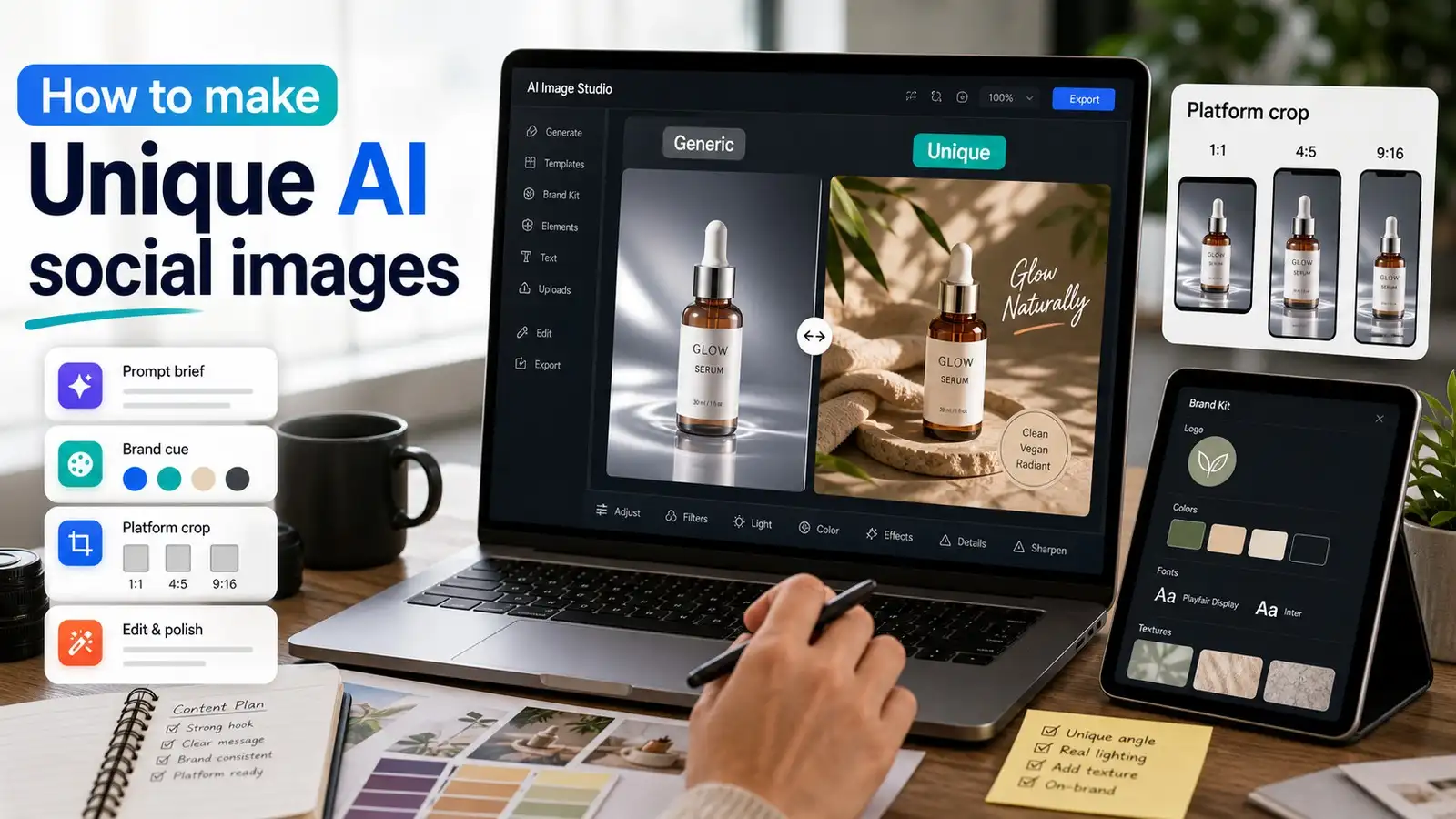
AI social media images look unique when the prompt is specific, the format matches the platform, and the final image feels real enough to trust. This guide shows how to avoid generic AI results and create branded, polished, social-ready visuals that actually fit the post. Use this formula for better results: Post goal + subject + real setting + platform format + brand cue + lighting + camera angle + texture + avoid list
Introduction
To make AI social media images look unique, start with a specific creative brief instead of a vague style prompt. Choose the platform format first, then add real-world details like lighting, texture, camera angle, brand color, and things to avoid.
Generate a few versions, edit the strongest one, crop it for the right channel, and check for fake-looking hands, shadows, text, logos, and over-polished surfaces before you post.
If you want a faster workflow, try a free AI image generator to create multiple social-ready variations, then refine the final visual with an AI image editor for media and entertainment.
Best prompt formula for AI social media images
If you want AI image prompts for Instagram or any other social platform to work better, use this blueprint:
Post goal + subject + real setting + platform format + brand cue + lighting + camera angle + texture + avoid list
This formula helps you avoid vague prompts and gives the generator enough structural constraints to create something useful on the first try.
Example prompt
"Create a 1:1 Instagram image for a small coffee brand announcing a weekend cold brew offer. Show a half-finished cold brew on a small cafe table next to a handwritten menu card, soft morning window light, muted olive napkin as the brand color, natural phone-photo realism, light condensation on the glass, slightly messy table surface. Avoid fake text, extra fingers, plastic shine, random logos, and over-saturated colors."
Why this works:
- The post goal & subject tell it exactly what to show and why.
- The setting & texture make the final image feel grounded and real rather than rendered.
- The platform format keeps the composition usable for square layouts.
- The brand cue & lighting control the mood and brand recognition.
- The avoid list removes common AI mistakes before they happen.
That is the core of how to make AI social media images look unique without making the prompt bloated or confusing.
Bad prompt vs good prompt
A vague prompt often leads to a vague image. A good prompt gives the tool enough detail to make a specific choice.
The second prompt works better because it tells the tool what the image is about, how it should feel, where it will be used, and what should not appear in it. That is the difference between a generic AI image and one that feels custom-made for a real brand.
How to make AI social media images look unique with Pixelbin
Open the AI image generator and follow the steps below:
Step 1: Write a short creative brief
To begin the process, enter a single, detailed sentence into the Pixelbin AI generator describing your exact scene. Avoid generic terms and focus entirely on specific elements like props, angles, and textures. This targeted input forces the system to avoid stock-looking defaults right from the start.
Sample prompt used: “Create a 1:1 Instagram image for a small coffee brand announcing a weekend cold brew offer. Show a half-finished cold brew on a small cafe table next to a handwritten menu card, soft morning window light, muted olive napkin as the brand color, natural phone-photo realism, light condensation on the glass, and a slightly messy table surface. Avoid fake text, extra fingers, plastic shine, random logos, and over-saturated colors."
Step 2: Choose the format & image model
Pick your desired image model. We have Nano Banana, Nano Banana Pro, Nano Banana 2, Seedream 4.5, and GPT image 2. Select your target layout style to lock in the proper boundaries before generating your variations. Choosing your aspect ratio first ensures that the AI builds its composition natively for your chosen layout. This preventative step prevents important visual details or text spaces from getting cut off later.
Step 3: Generate your image
Run the generator tool to produce your social media post based on your brief. You can also change the aspect ratios for different platforms. Below is another example of the same prompt using the 9:16 image ratio:
Step 4: Edit and export
Evaluate the results, and if you want more editing, you can do so with the built-in image editor. Use the smart toolsets to clear away distracting background elements, balance contrasting tones, and optimize sharpness for mobile displays. Taking a moment to polish these final details turns a standard rendering into a social-ready asset. Our tool has the following editing capabilities that you can try:
- Adjust: Fine-tune brightness, contrast, sharpness, and colors to improve the overall look of your image.
- Upscale: Increase image resolution while preserving clarity and important details for high-quality output.
- AI Edit: Instantly remove objects, replace backgrounds, or modify elements using AI-powered editing tools.
- Batch Mode: Apply the same edits to multiple images simultaneously to save time and maintain consistency.
- Video: Generate or enhance AI-powered videos from prompts or existing visuals for engaging content creation.
Once done, you can export your finished image or video in your preferred format, ready for sharing or publishing. We have only upscaled the image in this example. Check the final image below after image upscaling:
Why AI social media images look generic
Most AI images for social media look similar because the prompts sound similar.
If you write “modern social media graphic, high quality, realistic, vibrant, eye-catching,” the tool has very little direction. It will usually give you something polished but familiar. That is why so many AI posts have the same shiny lighting, perfect model faces, dramatic backgrounds, and vague brand feel.
Generic prompts create generic outputs because the model has to fill in too many gaps. When the brief is broad, the result usually falls back on the most common visual patterns it has seen before. The AI images for social media may look attractive, but they will also look familiar enough to blend into a crowded feed.
To break this cycle, you must stop treating the AI like a mind reader and start treating it like a photographer on a strict budget who needs exact directions. That’s the only way to make AI generated images look real.
What makes AI outputs feel generic
- The prompt uses broad words like “beautiful,” “professional,” or “viral.”
- The image has no real brand color, product cue, or recognizable setting.
- The lighting is too perfect for the scene (e.g., studio lighting in a park).
- The subject is posing rigidly instead of doing something natural.
- The background has no story or looks like an abstract gradient.
- The image includes fake words, broken logos, or strange object details.
- The same generic style is used for every post, even when the post goal changes.
A unique AI image starts with a specific situation. Do not ask for “a cool gym post.” Ask for:
“A slightly messy mirror selfie-style shot of a trainer tying shoelaces before a 6 a.m. class, warm tube light, black and lime towel on the bench, vertical 9:16 crop, no visible brand logos.”
That gives the tool a scene, not just a mood.
What does " unique " mean for social visuals?
When people search for how to make AI images unique, they are usually not asking for abstract creativity or high art. They want images that feel different enough to stop the scroll, but still usable for a real corporate or personal post.
In social media, “unique” usually means three things:
- Identity: The image should look like it belongs to one business and not any random competitor.
- Contrast: It should stand out in a feed full of similar, hyper-saturated visuals.
- Context: It should fit the native format and user behavior of the channel where it will be posted.
That is why making AI images look less AI is not just a realism problem. It is also a branding problem. A visual can be technically impressive and still feel flat if it does not match the post, the audience, or the platform. The best AI social post is not the most detailed one; it is the one that communicates the idea fastest. If a person can understand the message at a glance, the image is doing its job.
Quick checklist before you start
Before you write a single line of your prompt, make sure you know these seven things:
- The goal of the post: Are you educating, selling, or entertaining?
- The platform: Where will this live first?
- The subject: What is the main focal point?
- The setting: What does the environment look like?
- The brand cue: Which color or prop ties this to your identity?
- The crop: What ratio do you need?
- The avoid list: What AI quirks or clutter do you want to ban?
Without those, the prompt will drift into vague “nice-looking” territory instead of a usable social visual. This simple setup helps the image stay focused, makes the final result easier to use, and saves time because you are not fixing basic composition problems after generation.
Platform-first strategy for social posts
A common mistake is creating the image first and thinking about the crop later. That often cuts off faces, products, text areas, or important details. Pick the platform format before you write the prompt. Each channel rewards a slightly different structure, and the crop should support the post instead of fighting it.
If you are using free AI image generator tools for social media, this ratio-first step saves time later. It also gives the final image a better chance of fitting the platform cleanly. If you want to know how to use an AI image generator, here’s a complete guide for you.
How to make AI images look less AI
If you want to make AI images look less AI, be more than just a keyword phrase, you need a repeatable editing mindset. The easiest way to reduce the artificial look is to anchor the image in messy reality. That means using lighting that matches the scene, textures that make sense for the material, and everyday props that belong in the location.
Most effective changes
- Use natural or localized lighting instead of perfect studio beauty lights.
- Add a real, flawed place (like a concrete floor or a wooden table), not just an abstract backdrop.
- Include one or two human details (like a stray coffee cup or a notebook), but keep it minimal.
- Ask for specific textures (matte finish, grain, fabric weave) instead of smooth perfection.
- Avoid overuse of cinematic buzzwords like "hyperrealistic" or "photorealistic" in the prompt.
- Add a specific avoid list to eliminate plastic-looking skin or impossible architecture.
- Generate multiple versions and reject the obviously artificial, shiny ones.
Small imperfections often help the image feel real. A coffee ring on a desk, a slightly uneven shadow, a fold in fabric, or a natural window reflection can make the picture feel lived-in. Those details matter because they are the kind of things people expect from a real photo.
But there is a difference between believable imperfection and obvious error. You want realism, not mistakes. A better image is one that feels natural at a glance and still holds up when someone zooms in.
A few more rules to keep in mind:
- One main idea: One image should communicate exactly one message or subject.
- One brand cue: One distinct color choice or recurring prop is enough in most cases.
- One setting: A single believable setting is stronger than five random props crammed into a frame.
- One lighting direction: Unified shadows make the image feel coherent.
- One target crop: The composition should natively support your chosen platform.
If the image starts to feel fake, the issue is usually one of these:
- Too many contradictory adjectives in your prompt text.
- Too many floating objects cluttering the scene.
- Too much polish on surfaces that should naturally be matte or rough.
- Too much effort to force the image to look abstractly “creative.”
The best unique image often feels simple, grounded, and incredibly specific.
Brand-consistent social media visuals
If you want brand-consistent social media visuals, don’t rely only on logos. Logos can make an image feel too promotional too quickly, causing users to scroll right past it.
Instead, use subtle brand cues. Pick one repeating brand color, one texture or material, one recurring prop, one background style, one crop style, and one lighting style. If those elements repeat across your posts, people will start to recognize your brand on their feed even without a logo in the frame.
For example, instead of asking for “a branded skincare image with our logo,” ask for:
“A close-up bathroom shelf scene for a skincare brand, soft beige tiles, one deep green towel as the brand color, morning light, realistic product photography style, clean space on the right for headline text, no visible logos.”
That gives the image brand memory without forcing the visual identity too aggressively.
Social media AI image prompt templates you can copy
Below are copyable templates you can use when creating social media AI image prompt variations. Just paste them into an AI image generator for social media and keep modifying based on your needs:
Instagram product launch prompt
Create a 4:5 Instagram product launch image for a small skincare brand. Show a single serum bottle on a bathroom shelf with soft morning light, pale stone background, one sage green towel as the brand color, natural water droplets on the bottle, clean space on the left for text, and realistic product photography. Avoid fake labels, random logos, distorted bottle shape, plastic shine, and over-saturated colors.
LinkedIn carousel cover prompt
Create a 1:1 LinkedIn carousel cover image for a marketing team sharing a post about better visual content. Show a clean desk with a laptop, printed social media mockups, sticky notes, and a pen, soft daylight, calm professional color palette with navy and coral accents, top-down view, clear empty space in the center for headline text. Avoid fake text on papers, clutter, random logos, and unrealistic reflections.
Creator quote background prompt
Create a square quote-card background for a fitness creator. Show a gym bench, towel, water bottle, and morning light coming through a side window, slightly candid phone-photo feel, muted charcoal and lime color cue, shallow depth of field, clean empty space in the upper half for quote text. Avoid people, fake brand logos, heavy neon lighting, and over-sharpened textures.
E-commerce sale post prompt
Create a 1:1 social media sale image for a handmade jewelry shop. Show small gold earrings on textured cream paper, a torn kraft paper tag with no text, soft shadow, warm natural light, one deep burgundy ribbon as brand color, close-up AI product photography, and clean corner space for sale message. Avoid fake words, warped earrings, extra objects, glossy plastic finish, and random logos.
YouTube thumbnail background prompt
Create a 16:9 YouTube thumbnail background for a video about making better AI social media images. Show a laptop with a blurred image editing screen, phone with a social feed preview, strong side lighting, clean desk, blue and yellow accent objects, high contrast but realistic, empty space on the right for large headline text. Avoid readable fake UI text, random logos, distorted phone shapes, and clutter.
These templates are especially useful when you want to make AI social media images look unique without starting from zero every single time.
AI image editing tips for social media
An AI image generator for social media only gives the first draft. If you want strong AI social media images, you need to review them like an editor.
- Before posting, check whether the image is clear and readable on a phone screen.
- Then check the edges, reflections, hands, shadows, and product shape. If any of those look wrong, the image will feel off, even if the overall design is attractive.
The point of editing is not to polish the image until it looks artificial. The point is to make the image feel finished without losing realism. In practice, that means adjusting light, cleaning distractions, cropping carefully, and keeping the subject clear.
This is where an AI image editor for social media becomes useful. You can fix lighting, remove distracting objects, adjust framing, and get the image ready for the exact channel you are posting on. If the image still looks too polished, soften the highlights, add subtle texture, change the crop, reduce clutter, or shift the camera angle slightly. Often, a small post-generation change is enough to make the image feel more believable.
How to turn one AI image into five social posts
One strong AI image can be repurposed across several formats if you plan for it early.
- A square version (1:1) can work for an Instagram feed post.
- A vertical crop (9:16) can work for a Story or Reel cover.
- A tighter crop can isolate the product to work for a paid social ad.
- A version with extra blank space can become a clean backdrop for a quote card.
- A cleaner, more neutral crop can become a professional LinkedIn post header.
The key is to create the original visual with enough negative space and structure that later crops still make sense. That is why the main subject should not sit too close to the edge, and why you should leave open space where text overlays may later go. If you think about reuse early, one generation session can support a full week of social content.
How to make AI images look unique by channel
Different platforms need different visual choices. If you want to make AI images look unique to work in practice, the format should match the native ecosystem of the channel.
Instagram favors images that look native to an organic lifestyle feed. Use 4:5 or 1:1 ratios, strong contrast, and a clear focal point. Focus heavily on textures (like linen, wood grain, or stone) and soft lighting. Keep the composition simple enough that it still works when someone scrolls fast on a mobile device.
LinkedIn works best when the image feels useful, realistic, and professional. Use clean office desks, mobile devices, notes, charts, or editorial-style workspace compositions. Use corporate but warm color tones, and avoid overly flashy, neon, or fantasy visuals unless your brand is highly creative by design.
TikTok and Reels
For vertical short-form content, use a strict 9:16 crop and leave plenty of negative space near the top and bottom margins where UI overlays live. The subject should be obvious within the first half-second of viewing. Bright, natural, phone-photo style imagery usually performs significantly better than overly cinematic or dramatic visuals.
Pinterest rewards clear vertical structure and highly aspirational aesthetics. Use a 2:3 ratio, strong lifestyle compositions, and enough open background space to accommodate clean text overlays or design badges. This is a strong place to create high-contrast social visuals that support long-term blog traffic.
YouTube
Thumbnails need heavy contrast, extreme clarity, and instant semantic understanding. A 16:9 background image should show the main subject clearly isolated on one side of the frame (usually the left or right third), leaving the remaining space perfectly clear for large, bold headline text overlays.
How to maintain brand consistency with AI social media images
A strong visual system helps you make AI social media images look unique while still staying cohesive over time. Establish a strict set of parameters for your brand:
- One hero brand color accent.
- One subtle supporting background color palette.
- One consistent lighting style (e.g., natural morning light).
- One default crop style per platform.
- One recurring style of prop (e.g., green plants, craft paper notes).
- One strict rule for negative space (for text overlays).
- One clear rule for human presence (e.g., hands only, or no people at all).
For example, for a B2B SaaS brand, the background can be a real desk or device scene, the color cue can be a specific blue accent object, the lighting can be soft daylight, the crop can be 1:1 for LinkedIn and 16:9 for blog shares, the texture can be matte screens and paper notes, and the avoid list can include floating UI, fake dashboards, and unreadable text.
That way, every single post can feel brand new without losing instant brand recognition. This is one of the best ways to keep brand-consistent social media visuals from becoming visually stale or repetitive.
When not to use AI images on social media
Sometimes AI is the wrong choice, and acknowledging that openly builds long-term audience trust. Avoid AI visuals entirely in these situations:
- When the post covers a highly sensitive, emotional, or political topic.
- When the image features real-looking people in a way that feels deceptive.
- When the content could easily be mistaken for a real-time news event.
- When the product claims are highly specific, regulated, or feature actual e-commerce items.
- When the post is news-like, testimonial-based, or legally sensitive.
In those cases, stick to original photography, high-quality licensed stock, or use a much clearer style of graphic design overlay. The goal is not to force AI into every single post; the goal is to use it where it actually scales your creative workflow.
Should you disclose AI images on social media?
Yes, if the image shows real-looking people, actual physical products, news-like events, sensitive topics, or anything a viewer could reasonably misunderstand as an unedited real photograph, disclosure is the safer and more ethical choice. Audience trust matters far more than a short-term engagement bump.
For abstract graphics, background textures, fantasy digital art, or clearly stylized vector visuals, disclosure may be less urgent, but it still depends entirely on your specific brand voice, industry, and platform terms of service.
A simple, transparent disclosure caption is often more than enough:
Image created with AI and edited by our team.
This keeps the post transparent without turning the caption into a dry legal disclaimer.
Common mistakes to avoid
Below are some of the common mistakes that you need to avoid while making your AI images for social media feel natural and unique.
- Asking for “viral” images: “Viral” is an outcome, not a visual direction. The AI model does not know what makes an image go viral. Ask for a clear scene, a specific camera angle, and a clear human emotion instead.
- Using the same style for every brand: If every brand uses the same glossy, high-contrast, or cinematic look, no one stands out on the feed. Build a unique visual system that matches your specific target audience.
- Putting too much text in the prompt: AI tools are getting better with typography, but social post text should usually be added manually after generation. That gives you clean spelling, proper kerning, and a stronger, more readable layout.
- Publishing without zooming in: Always zoom in to 100% before uploading. Check hands, product labels, background shadows, jewelry placement, messy power cables, reflections, and distorted background objects.
- Ignoring the feed grid around the post: An image may look incredible on its own, but completely clash with your last few uploads. Open your profile grid or content calendar and check whether the new image color palette actually belongs.
Quick checklist before you post
Use this final review before hitting publish on any channel:
- The image has one clear, unobstructed subject.
- The aspect ratio and crop natively fit the target platform.
- The brand cue is visible but doesn't feel forced or unnatural.
- The image does not rely on scrambled or fake AI text.
- Hands, faces, reflections, and product edges look normal under close inspection.
- The lighting and shadows match the environment consistently.
- There is enough clean negative space for captions or text overlays.
- The key message of the image is perfectly legible at phone size.
- The final crop does not cut off important details or product edges.
- The overall post still feels human, authentic, and genuinely useful.
Conclusion
The best AI social media images do not look unique because the prompt is longer. They look unique because the visual idea is clearer.
Start with the post goal. Choose your layout format first. Add a real scene, one distinct brand cue, natural lighting, and the micro-details that make an image feel lived-in. Then review and edit the final version before it ever reaches your public feed.
If you want to try this workflow yourself, open Pixelbin’s free AI image generator, create 3 completely different variations of your next post idea, and use the checklist above to choose the one that feels most like your brand. Then refine it in the AI image editor for media and entertainment, and publish the best version.
FAQs
Use a specific creative brief instead of a generic style prompt. Mention the platform, audience, subject, setting, brand color, lighting, camera angle, texture, and what to avoid. Generate several versions, edit the best one, and crop it for the right platform.
Add natural lighting, real-world settings, small textures, mild imperfections, and avoid instructions for fake text, plastic skin, extra fingers, warped products, and impossible reflections.
Use this formula: post goal + subject + real setting + platform format + brand cue + lighting + camera angle + texture + avoid list. This gives the image generator enough direction without making the prompt messy.
Yes, but review the image carefully before publishing. Avoid misleading visuals, fake people or products, copyrighted characters, unreadable logos, and anything that could confuse your audience. For commercial or sensitive use, check your tool’s terms and your brand policy.
It depends on the platform. Square works well for flexible feed posts, 4:5 often gives more space in mobile feeds, 9:16 is best for Stories, Reels, TikTok, and Shorts, and 16:9 works for YouTube thumbnails, blog headers, and link previews.
A strong Instagram image usually has one clear subject, a mobile-first crop, a real setting, recognizable brand cues, natural lighting, and enough contrast to stop the scroll without looking like a generic ad.